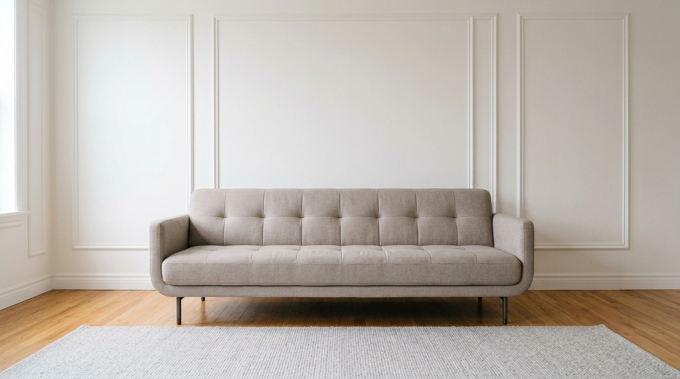
Benjamin Moore Alabaster OC-129 is a soft, warm off-white with a subtle pink undertone and an LRV of 85.08. It is bright enough to keep rooms feeling airy without looking stark white.
Well, when you think of choosing white paint, it might sound pretty simple. But dozens of whites look almost identical on a paint card but completely different on a wall.
Benjamin Moore Alabaster sits somewhere between crisp white and warm cream. It has a slight pink undertone that gives it warmth without making the color look overly beige or yellow. It works with a wide range of interiors, from warm wood and beige to black, gray, and deeper colors.
So, the question narrows down to: “Is Benjamin Moore Alabaster the right white for your home?” Read the blog to the end to learn more.
What are the Characteristics of Benjamin Moore Alabaster?
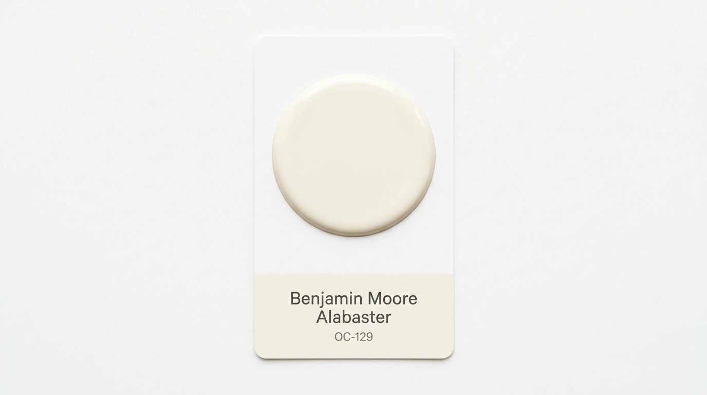
Benjamin Moore Alabaster is also known as Alabaster 876, Atrium White PM-13, and Atrium White OC-145. Here are some characteristics of the color that you should know before choosing this:
- It’s part of Benjamin Moore’s Off White Collection.
- It is described as a fresh, youthful white with a flattering hint of pink.
- It has an LRV of 85.08, making it highly reflective.
- It reads as a soft white rather than a bright, pure white.
- It has a warm undertone that makes a space feel more comfortable, but it still looks light and clean.
The best part is that the paint lasts longer and looks beautiful for many years to come.
How Does Benjamin Moore Alabaster Look in Different Lighting?
Lighting can change how any white paint looks.
- In bright natural light, its high LRV helps it look light, fresh, and airy. This works best in rooms with large windows or plenty of natural light.
- In lower-light spaces, its warm side becomes more noticeable. Rather than looking stark, the walls can take on a softer, more comfortable look.
Warm lighting can also bring out Alabaster’s pink undertone. However, this doesn’t mean the color will suddenly look pink. The effect will be subtle, like a slight rosy pink, to keep the white from feeling flat.
Where Can You Use Benjamin Moore Alabaster?
Benjamin Moore Alabaster is versatile and works well in several rooms, including the living room, kitchen, bathroom, and open-concept spaces.
Living Room
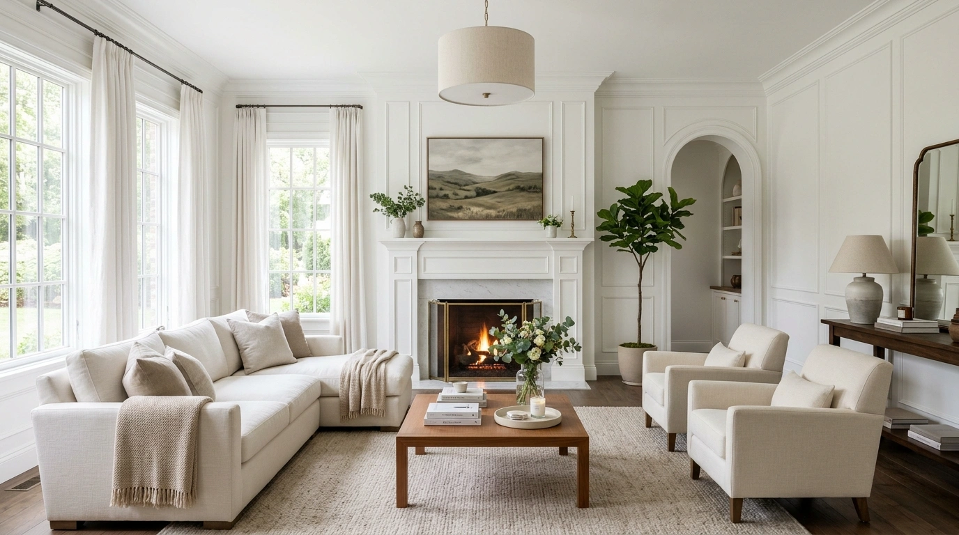
Alabaster works especially well in living rooms and pairs well with warm wood, leather, beige upholstery, stone, and woven textures. It feels warm and relaxed. You can also pair it with darker elements such as black furniture and bold accents. This adds contrast and a modern look without feeling too harsh. For a traditional or cozy feel, add earthy tones like terracotta or warm brown.
Kitchen
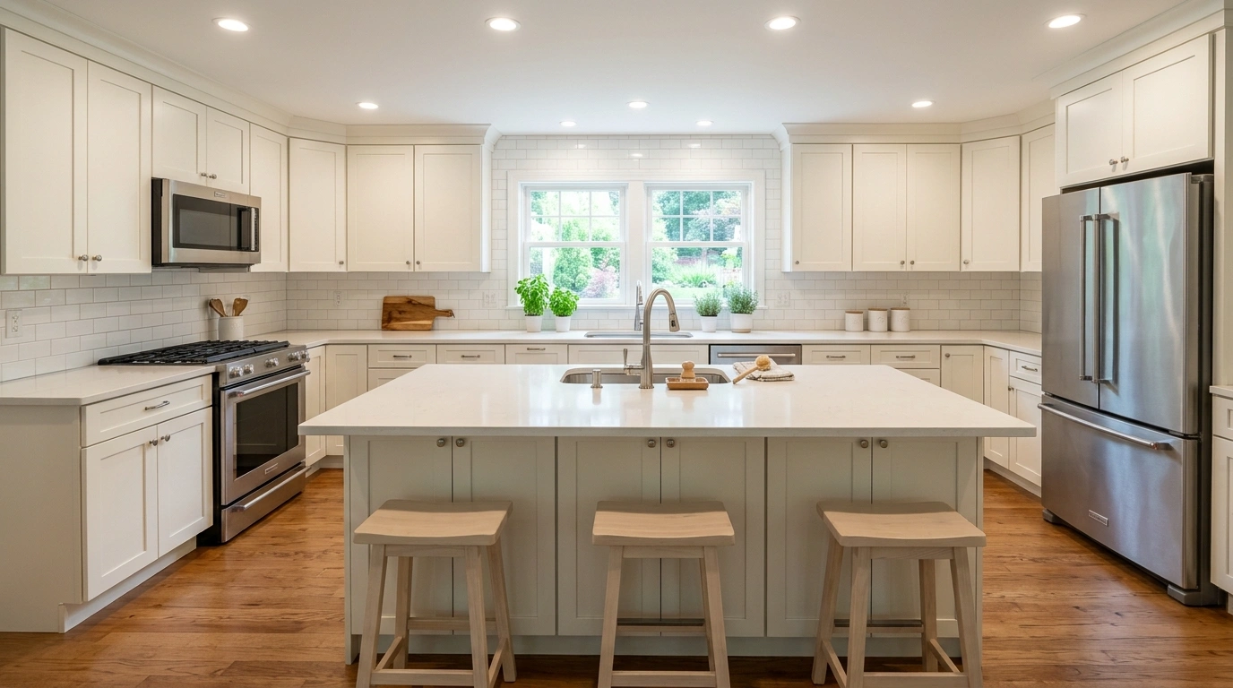
Choosing the right shade of white for the kitchen can be quite challenging. So, Benjamin Moore Alabaster can be the best option. This soft white creates a backdrop for marble or quartz countertops, cabinets, wood flooring, and metal or brass hardware. The result will feel stylish and comforting, and it will make cooking feel luxurious.
Bedroom
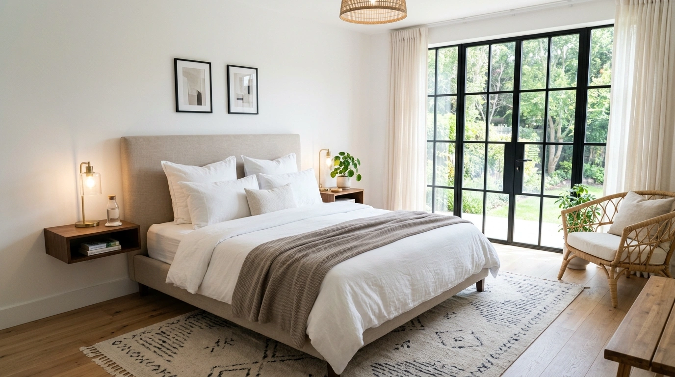
White is no doubt the calmest color; Alabaster is a great shade to consider for its soothing qualities. Pair it with white or cream bedding, warm wood, soft linen, natural texture, beige, or muted gray to make your personal space more relaxing.
Add layers of texture, such as knitted throws or a linen duvet cover. Add solid-colored or patterned pillows or artwork to make your space more intriguing.
Bathroom
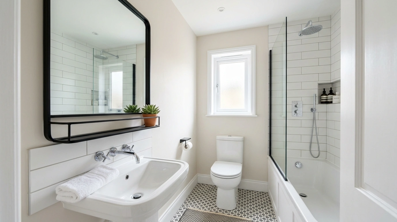
The bathroom needs a more airy color scheme so the space feels refreshing and lively. Benjamin Moore Alabaster can give your space a soft, bright, fresh look.
Pair it with a chrome or brushed nickel fixture for a crisper look. On the flip side, pairing it with brass or bronze hardware can create a warmer look. Add green plants and other accent elements to make the bathroom feel more like a spa.
Hallways and Open Floor Plans
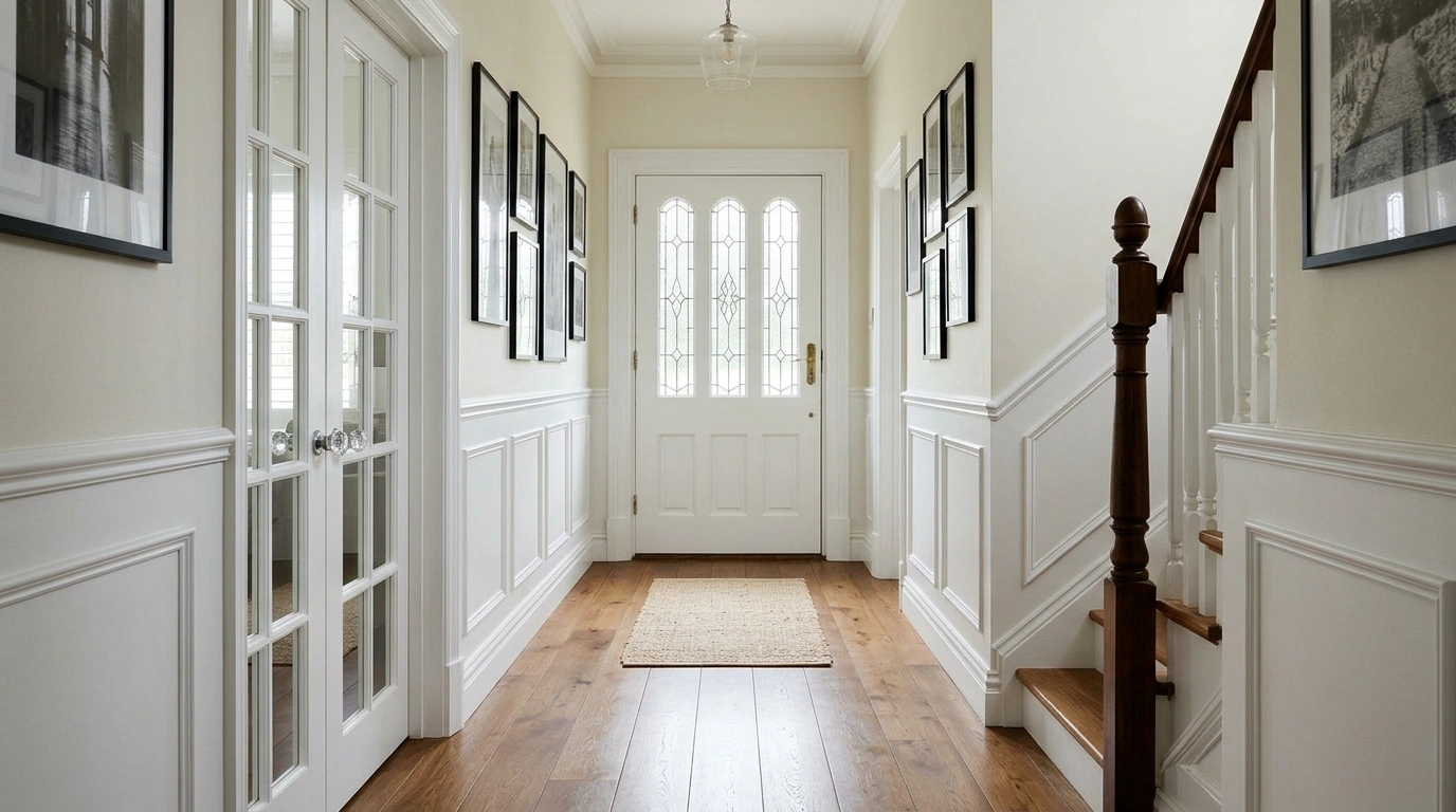
Benjamin Moore Alabaster works throughout the home. Its soft look, along with rugs and artwork, works beautifully. All-white may not be everyone’s first choice, but pairing it with an accent color can create visual separation.
How Does Benjamin Moore Alabaster Compare to Other Whites?
Simply White and Dove White are other options that may look quite similar to the Alabaster OC-129. Here’s a brief explanation that tells you the difference between Benjamin Moore Alabaster vs Dove White and Simply White:
Benjamin Moore Alabaster vs Dove White
White Dove (OC-17) is also a favorite color among designers and homeowners. Though it has a soft, creamy undertone, White Dove is a bit cooler and lighter than Alabaster. Using it in your space can also make the area look airy and open.
Benjamin Moore Alabaster vs Simply White
Simply White seems brighter and more neutral, which is mostly loved in contemporary and modern spaces. The color has a higher LRV than Benjamin Moore Alabaster, meaning it reflects more light and appears brighter on the walls.
Which Colors Coordinate Well with Alabaster OC-129?
Here are some coordinating colors for Alabaster OC-129:
- Calm OC-22
- Baked Terra Cotta 1202
- Garlic Bulb 2112-70
- Amorous AF-600
What Colors Pair With Benjamin Moore Alabaster OC-129?
You can pair the following colors with Alabaster OC-129 for a chic-looking space:
Soft Warm Neutrals for a Cozy Backdrop
- Benjamin Moore Revere Pewter HC-172
- Benjamin Moore Edgecomb Gray HC-173
- Benjamin Moore Manchester Tan HC-81
Deep, Rich Blues for Bold Contrast
- Benjamin Moore Hale Navy HC-154
- Benjamin Moore Bachelor Blue 1629
- Benjamin Moore Van Deusen Blue HC-156
Soft to Deep Greens for a Fresh, Natural Feel
- Benjamin Moore Hancock Green HC-117
- Benjamin Moore Prescott Green HC-140
- Benjamin Moore Essex Green HC-188
Terracotta And Rust Tones for Warm Earthy Accents
- Benjamin Moore Terra Cotta Tile 2090-30
- Benjamin Moore Rich Chestnut 2090-20
- Benjamin Moore Wild Flower 2090-40
How Does Benjamin Moore Alabaster Compare to Sherwin-Williams Alabaster?
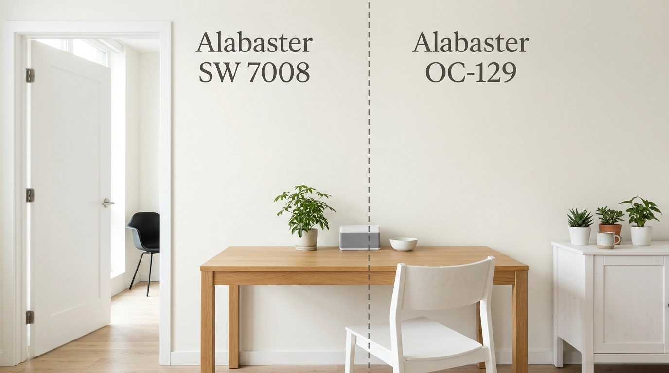
As the name ‘Alabaster” is the same for both brands, you have to be a bit careful. They are both white and fall into the soft-white category. However, they are quite different in terms of characteristics, undertone, LRV, etc. Here is a comparison explained in a table:
| Features | Benjamin Moore Alabaster | Sherwin-Williams Alabaster |
|---|---|---|
| Color Code | OC-129 | SW-7008 |
| LRV | 85.08 | 82 |
| HSL | 38°, 30%, 93% | 46°, 27%, 90% |
| Undertone | Pink and gray | Hint of soft cream or yellow |
| Best Used as | Exterior walls, trims, doors, cabinets | Interior walls, trims, ceilings, kitchen cabinets, and exterior of the home |
Not sure if Sherwin-Williams Alabaster is the right white for you? See how it compares with another warm white in our Alabaster vs Greek Villa guide.
Conclusion
Benjamin Moore Alabaster OC-129 is a soft, warm off-white with hints of pink and gray undertones. It has an LRV of 85.08 and looks almost like Sherwin-Williams Alabaster SW-7008. However, a few differences set them apart. Benjamin Moore works best in living rooms, kitchens, bedrooms, bathrooms, and even open-concept spaces.
Depending on the space, you can pair it with brass accents, natural textures, warm wood, beige, and more. However, sample the color in different lighting to ensure it suits your space.
Frequently Asked Questions
Does Benjamin Moore Alabaster look pink?
Yes, Benjamin Moore Alabaster OC-129 looks pink, but it also has a subtle gray undertone. With an LRV of 85.08, it usually appears soft white, but cooler light can bring out a faint blush, especially when paired with organic decor.
Is Benjamin Moore Alabaster warm or cool?
Benjamin Moore Alabaster is a warm off-white, making it ideal for people who want a welcoming, calming white that doesn’t feel stark.
Does Benjamin Moore Alabaster go with rust tones?
Yes. Because of its pink undertone, Benjamin Moore Alabaster OC-129 can make a space feel rich when paired with earth tones.
Why is Alabaster white so popular?
Alabaster is a soft white that doesn’t make the space feel flat. It gives a hint of pink or gray and looks beautiful under different lighting.